ITS Website: Airline Travel
Travel
Customer Portal
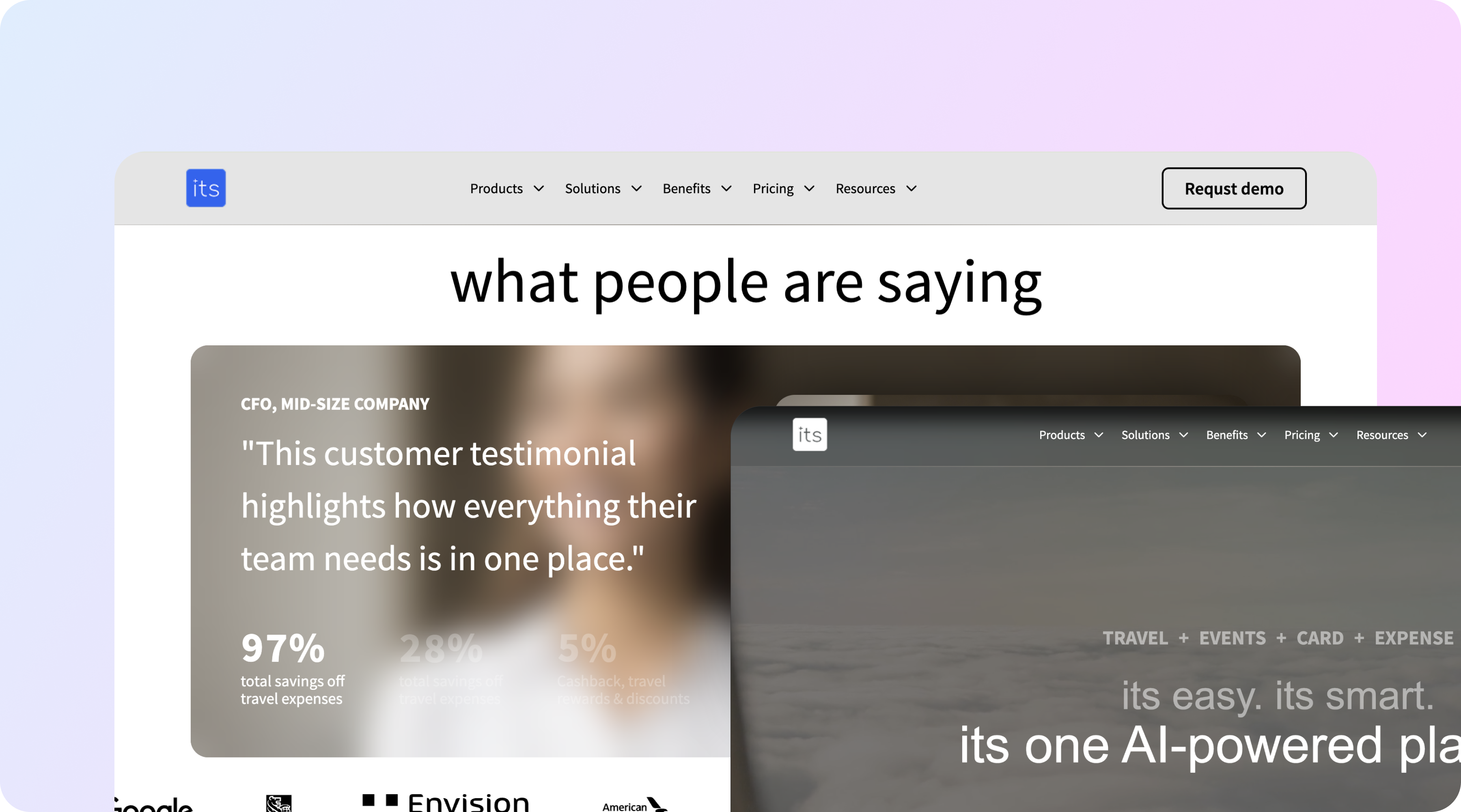


CLIENT
Internet Travel Solutions
CATEGORY
Travel
TIMEFRAME
5 Weeks
SERVICE
UX/UI
Development
About Project

- Qualified enquiries up 3.4x in the first quarter after launch.
- Average time on site from 40 seconds to 3 minutes 20.
- Sales cycle shortened by an estimated 2 weeks, with prospects arriving already understanding the service model.
- Full site delivered in 5 weeks, including content structure and copy.
- Mobile bounce rate down 34 points.
- Built in 5 weeks.
Challenge & Solution

Challenge
The company lacked a cohesive digital presence capable of communicating enterprise service offerings clearly to airline partners and travel industry clients.

Solution
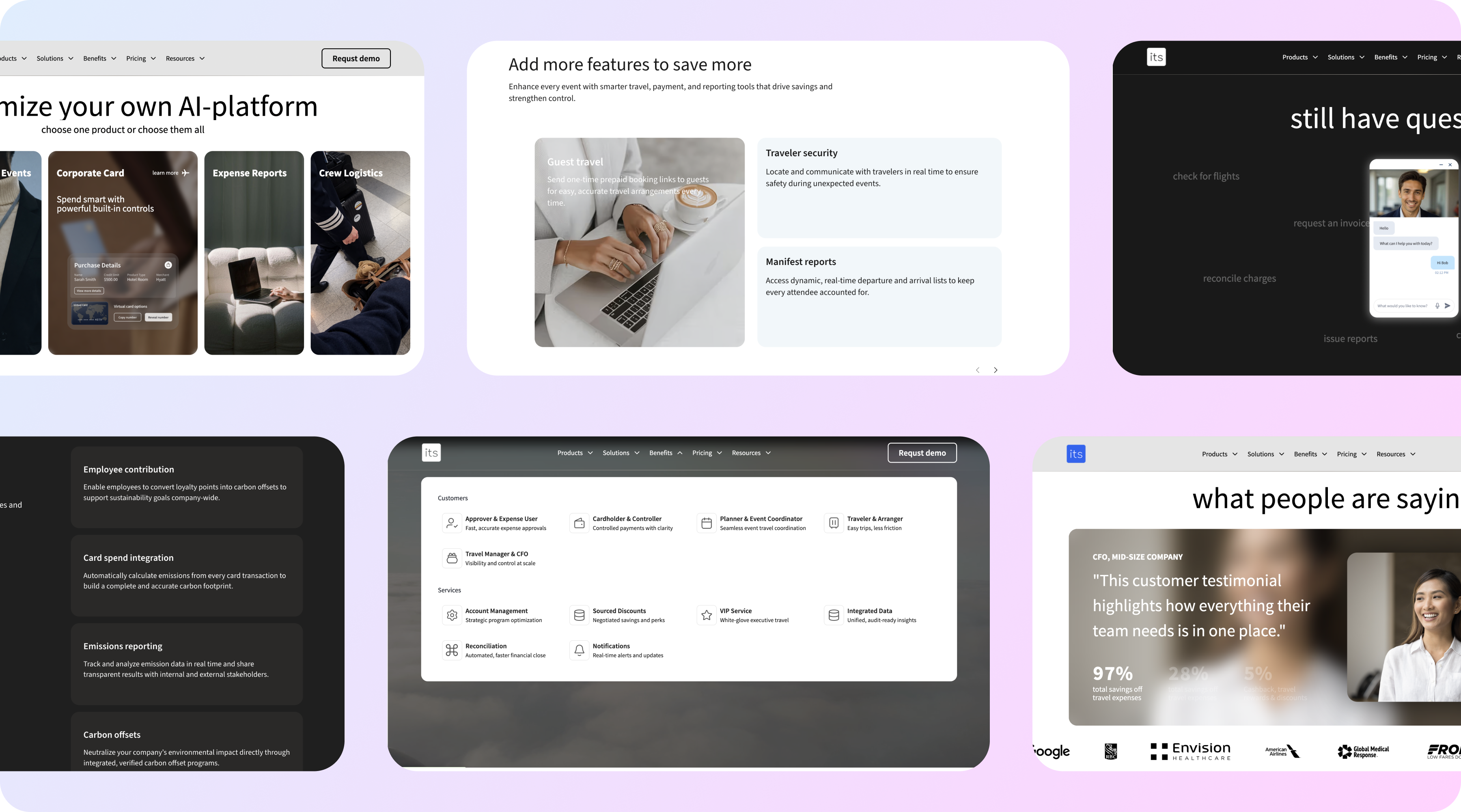
We designed a structured web experience that organizes service storytelling and improves brand credibility, enabling the company to communicate value clearly and strengthen enterprise client acquisition efforts.
The company sold enterprise services to airlines and travel operators and had a website that could have belonged to any B2B firm in any sector. Generic imagery, a services list written in abstractions, and nothing that would tell an airline procurement lead that these people understood aviation.
The commercial cost was specific. Deals were won on relationships and reputation, and the website actively undermined both. Prospects who had heard good things arrived, found nothing that matched what they had been told, and the salesperson spent the first meeting re-establishing credibility the site should have carried.
The brief was not a redesign in the visual sense. The site needed to demonstrate domain understanding in the first ten seconds, and to say clearly who the company serves and what it actually does, which the existing copy managed to avoid across four hundred words.
The enquiry quality change mattered more than the volume. Sales stopped spending first meetings explaining what the company does, which is where the two-week cycle reduction comes from.
The case study format is now used in proposal documents as well as on the site, because it turned out to be the clearest articulation of the delivery model the company had ever written down.
An information architecture organised by client type and operational problem rather than by internal service naming, so an airline operations director lands somewhere that describes their situation.
Service pages written around specific scenarios with named systems, integrations and compliance frameworks, since specificity is what signals competence to a technical buyer.
Case study templates structured for enterprise procurement, with scope, timeline, integration detail and outcome, in a format that survives being forwarded internally.
Beyond that: a capability matrix mapping services to client categories, gated technical documentation for qualified prospects, an enquiry flow that routes by client type and captures qualification detail up front, and a CMS built so the marketing team can maintain all of it without developer involvement.
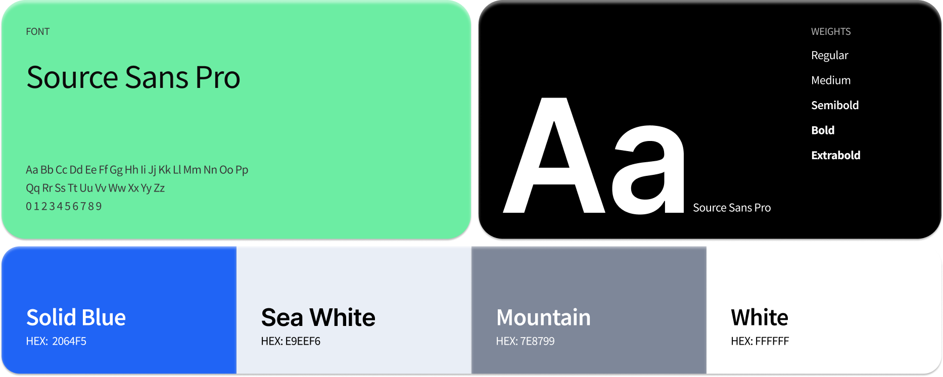
Typography & Color