JetStarix: Charter Aviation
Customer Portal
Aviation


CLIENT
Charter Aviation Company
CATEGORY
Customer Portal
TIMEFRAME
5 Weeks
SERVICE
UX/UI
Development
About Project

- Charter enquiries up 2.8x within two months of launch.
- Average enquiry value up 41%, with positioning attracting a different client profile.
- Quote request completion at 71%, up from 22% on the previous form.
- Delivered in 5 weeks including photography direction and copy.
- Page load under 1.2 seconds on mobile despite a heavy visual treatment.
- Built in 5 weeks.
Challenge & Solution

Challenge
The company lacked a modern digital presence capable of communicating premium aviation services effectively to high value travel clients.

Solution
We designed a structured digital experience that improves service storytelling, enhances brand credibility, and simplifies inquiry workflows, helping the company attract and convert high value aviation clients.
Private charter is sold on trust and on feel, and the client's website was communicating neither. It looked like a regional travel agency, which for a business asking people to spend five figures on a flight is a serious problem.
The specific failure was the quote form. Eleven fields, including several a prospective client could not answer without already knowing how charter pricing works, sitting behind a button labelled Submit. Under a quarter of the people who started it finished, and the ones who did arrived with incomplete information anyway.
The client also knew they were attracting the wrong enquiries. The site's tone invited price shopping, so most contacts were people comparing against commercial business class rather than clients for whom the service is the point. Repositioning was as much of the brief as rebuilding.
The 22% to 71% completion figure is the whole commercial result. The traffic did not change much; the number of people who finished asking for a quote more than tripled.
The repositioning showed up in enquiry value. A 41% increase in average enquiry size came from the site talking to a different buyer, which was the harder and more valuable half of the project.
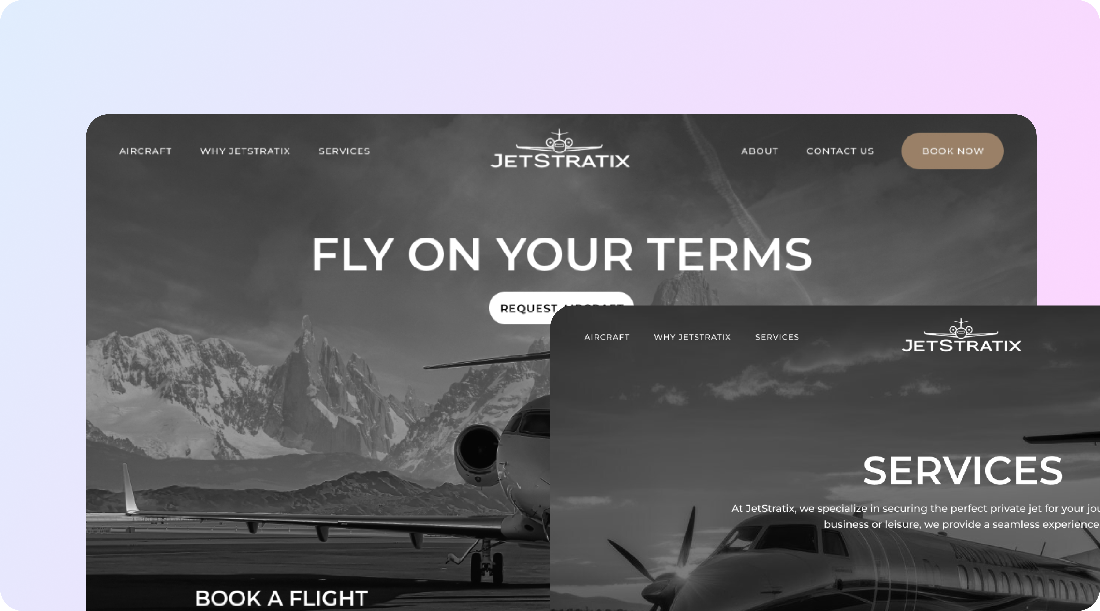
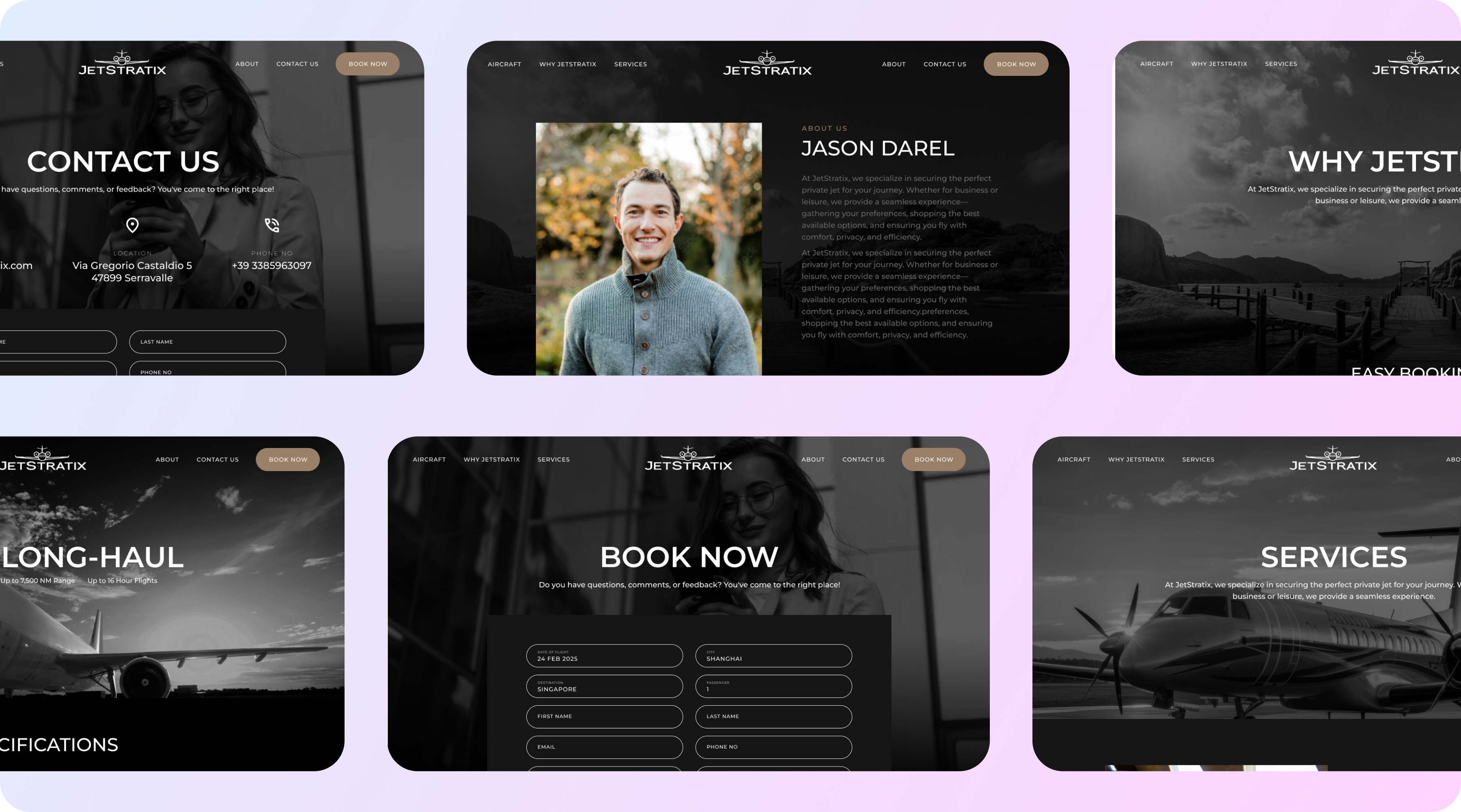
A visual treatment built around the aircraft and the experience rather than stock travel imagery, with art direction specified and photography commissioned to match.
The quote flow was rebuilt as a short progressive sequence: route, dates, party size, then optional detail, with intelligent defaults and no field a first-time charter client cannot answer. It captures more usable information than the old form while asking less.
Fleet pages carry specification, cabin configuration, range and typical routing, presented so a knowledgeable client gets the detail and a first-time client is not lost.
Beyond that: an empty-leg listing that updates without developer involvement, service pages for corporate, leisure and group charter written to different buyers, and image delivery tuned so a visually heavy site still loads fast on a phone.
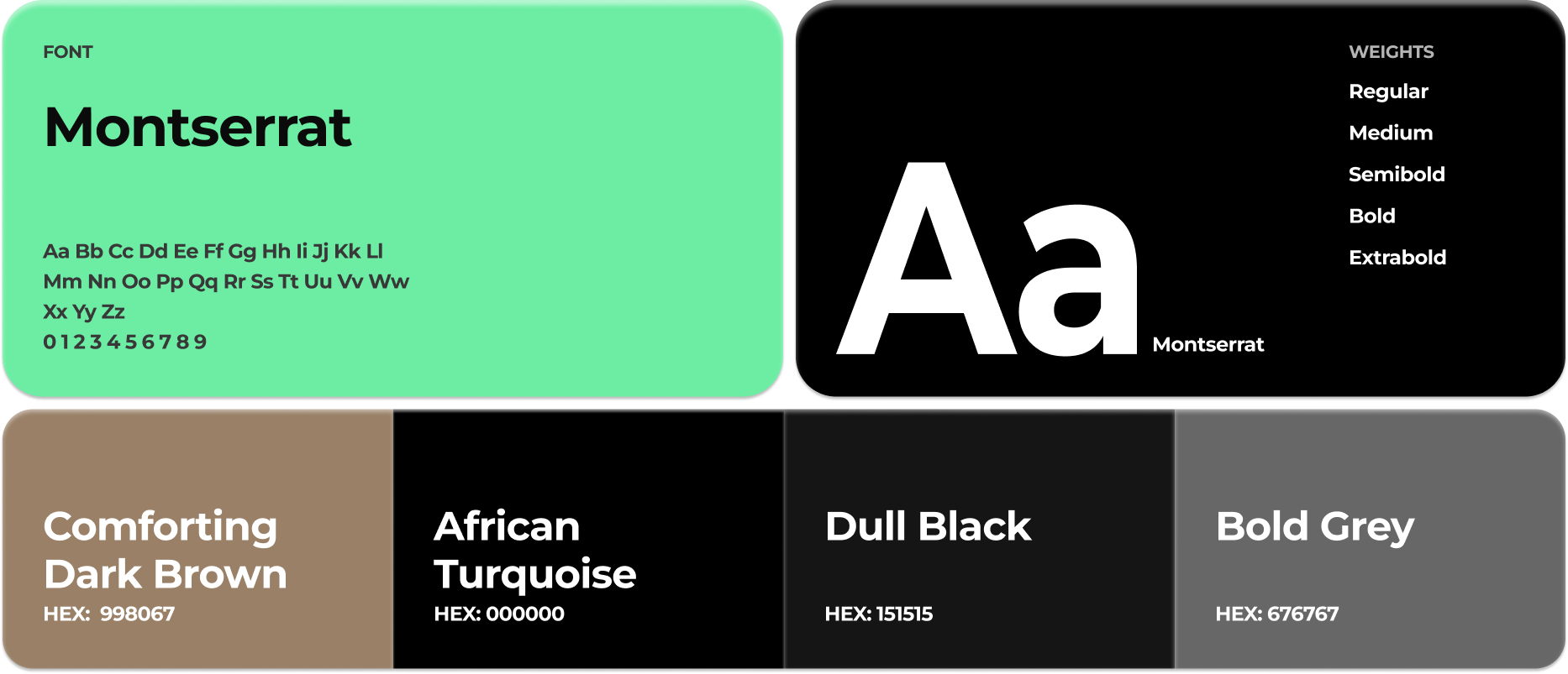
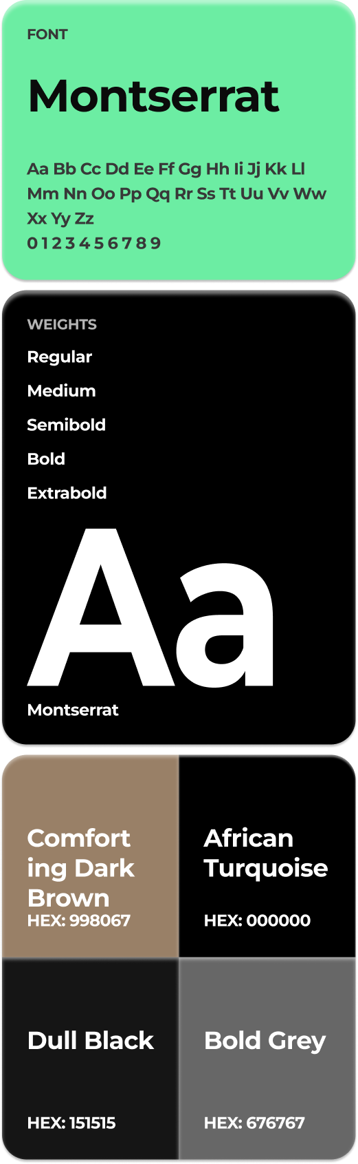
Typography & Color